Dithering vs Halftone: Which Texture Works for Your Poster?
Compare dithering and halftone on the same poster, from close-up marks to thumbnail size. Recreate three textures with exact settings in Artfkt for Mac.

Choose ordered dithering for a regular pixel pattern, noise dithering for irregular stippling, and round-dot halftone for a printed-screen texture. Each can turn a photograph’s shading into marks. For a poster, the useful choice is how those marks support the subject at the size people will see it.
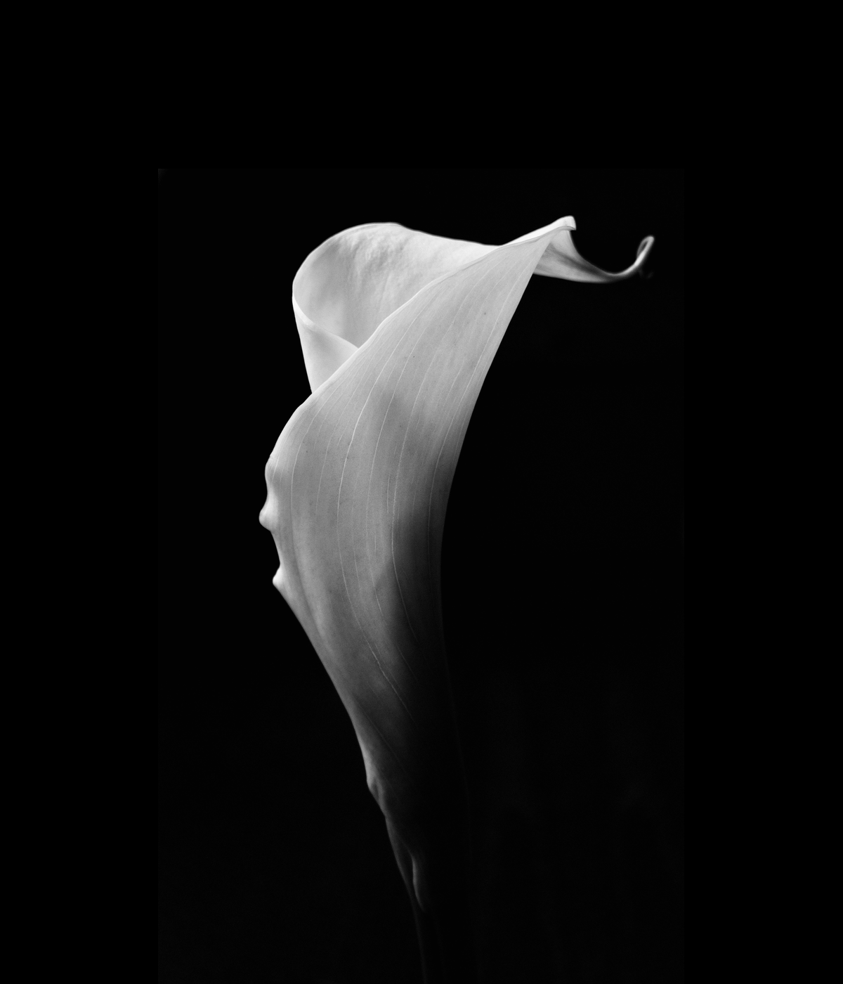
The four posters above use the same calla-lily photograph, crop, dimensions, and separate lettering. The three treatments share a dark green and cream palette. Only the image’s effect changes; FORM stays untreated.
This guide compares the looks first, then gives exact recipes in Artfkt for Mac. Dither and Halftone belong to the desktop collection library and are outside the current free browser demo. Artfkt requires an Apple Silicon Mac running macOS 13 or later.
On this page: compare the marks, choose a texture, recreate the examples, and check the final size.
What is the difference between dithering and halftone?
Both can suggest continuous shading with a restricted set of marks. In the Ordered Dither example, fixed-size cells switch between two colors according to a repeating Bayer threshold pattern. Noise Dither uses irregular, seeded thresholds instead. Halftone Dots changes the coverage of round ink dots on a regular screen, so the dots grow into darker regions.
The terms overlap. Digital halftoning includes methods described as dithering; “halftone” does not always mean a round-dot screen. Maxon’s guide to dithering and palettes includes halftone patterns within its discussion of dithering. Here, we are comparing three specific visual treatments, not dividing all image processing into separate categories.

The same 360 × 360 region from each full-resolution export. Top left: original; top right: Ordered Dither; bottom left: Noise Dither; bottom right: Halftone Dots.
Look at the shaded edge on the right of each crop. Ordered Dither breaks it into a predictable sequence of squares. Noise Dither makes the boundary more scattered. Halftone Dots keeps a regular diagonal rhythm, with dark dots expanding and joining as the flower falls into shadow. None retains all the original photograph’s fine veins.
Which texture works for your poster?
| Treatment | Visual character | Choose it when… |
|---|---|---|
| Ordered Dither | Repeating squares and checker-like transitions; the grid becomes part of the drawing. | You want a deliberate pixel texture and a structured rhythm across the image. |
| Noise Dither | Irregular stippling, with isolated marks visible even in this photograph’s faint background tones. | A loose, speckled treatment suits the artwork and a repeating pattern would feel too rigid. |
| Halftone Dots | Round dots on an angled screen; dot coverage changes across the flower’s shaded fold. | You want the image to suggest a screened print while retaining the subject’s broad silhouette. |
For this poster, Halftone Dots gives the clearest print-like cue. Ordered Dither makes the geometric pattern more prominent; Noise Dither makes the quiet background busier. Those are choices for this source and these settings, not a ranking of the techniques. A different photograph can change the balance.
Recreate the three treatments in Artfkt
Prepare the source and lettering
Download the prepared source PNG
(1200 × 1400, without lettering or effects). Photograph by Jocelyn Morales, used under the Unsplash License. The preparation preserves the photograph’s proportions, scales it to 1160 pixels high, and centers it below a 240-pixel headline area on a black field.
Start an empty session and add the PNG. Keep the image centered, Scale (%) at 100, rotation at 0°, and canvas dimensions at 1200 × 1400. Leave the Document effect stack empty. Add each treatment to the image layer, replacing the previous effect so that only one is active.
Keep playback paused at the start, Composition motion off, and the selected effect’s Motion off. Set Mix to 100% and both effect colors to full opacity. The recipes use dark green #152b2a and cream #f2ebd9.
For the headline, choose Add → Text, then Edit text, enter FORM, and confirm with Command+Enter. Keep it above the image with an empty effect stack. Use bundled Inter:
- Font size: 180 px; weight: 800; style: normal
- Color: #f2ebd9; alignment: center
- Letter spacing: 14 px; word spacing: 0 px; line height: 1
- Box width: 1100 px; Auto height
- Scale: 100%; rotation: 0°
- X position: 0; Y position: −590

The reference composition. The lettering and image placement stay identical in every treatment.
Recipe 1: Ordered Dither
Add Ordered Dither from the Dither collection.
- Mark size: 0.400%
- Matrix size: 4 × 4
- Tone balance: 0.00; Contrast: 1.00
- Dark color: #152b2a; Light color: #f2ebd9
- Mix: 100%

Ordered Dither: a repeating pattern is most visible across the broad middle tones.
Set Mark size before Matrix size. The first changes the scale of the cells; the second changes the repeating threshold pattern. After choosing the texture, use Tone balance to adjust how often the light or dark color appears. Positive balance favors the light color.
Recipe 2: Noise Dither
Replace Ordered Dither with Noise Dither, also from Dither.
- Mark size: 0.400%
- Tone balance: 0.00; Contrast: 1.00
- Seed: 37
- Dark color: #152b2a; Light color: #f2ebd9
- Mix: 100%

Noise Dither: the cell size and palette match Ordered Dither, but the thresholds are irregular.
The scattered background marks come from faint tones already present in the photograph. Keep Seed fixed while judging size and tone; changing it redistributes the pattern. Noise Dither is not error diffusion: this effect makes seeded threshold choices without passing quantization error between neighboring cells.
Recipe 3: Halftone Dots
Replace the dither effect with Halftone Dots from the Halftone collection.
- Screen size: 0.012
- Angle: 45°
- Ink gain: 0.00
- Ink: #152b2a; Paper: #f2ebd9
- Mix: 100%

Halftone Dots: a 45° screen with dot coverage following the photograph’s tones.
Choose Screen size before Ink gain. Increasing Ink gain expands the dark coverage; it does not add more source detail. Angle turns the screen pattern without rotating the photograph. Screen size and Mark size use different scales and geometry, so identical numbers would not make a matched comparison. These recipes share a composition and palette, not a calibrated dot pitch or equal measured tone.
These are artistic digital image effects. A PNG made with them is not a set of press-ready ink separations. For two-ink styling, continue with the risograph poster tutorial; for threshold and toner distress, see the photocopy poster tutorial.
Why does the texture change when resized?
Reducing a raster image combines multiple source pixels into fewer output pixels. Small marks can blend into apparent intermediate tones; regular patterns can also develop uneven bands or beats. A texture that looks crisp close up may become faint, busy, or quite different in a thumbnail.

Each 1200 × 1400 export was reduced to 180 × 210 pixels, then enlarged two times with nearest-neighbor sampling so the thumbnail pixels can be inspected here. These are resized exports, not new effect renders. The page may scale this comparison further to fit your screen.
Here, the broad flower shape and headline survive reduction, while the original fine veins and many separate dither marks do not. The ordered pattern changes character across the middle tones. The halftone screen remains more obvious at this recipe’s larger spacing. Judge the size you will actually share, not only a zoomed-in preview.
The marks swallow the edge

Only Ordered Dither’s Mark size changes: 0.400% on the left, 2.000% on the right.
The larger cells sample less of the flower’s shape. Lower Mark size to recover a finer boundary before changing Contrast. For Halftone Dots, reduce Screen size instead. More contrast cannot recover detail that the marks are too large to describe.
The texture disappears or forms bands
Check the exported file at its intended dimensions. Try a modest size adjustment and compare again; with Halftone Dots, try a different Angle too. If the destination resizes or compresses images, inspect its resulting image. A clean full-resolution export does not guarantee an identical small preview.
The lettering gets textured too
Keep the treatment on the image’s effect stack and the headline on a separate text layer. A Document effect processes the combined composition. The poster layer workflow explains this separation; the editable text guide covers revising the words.
Export and keep an editable version
Choose Quick Export → PNG for a still at the source dimensions. Check both the full-size image and a reduced copy. Save an Artfkt project to retain the editable headline and effect settings.
Explore Dither for other mark systems or Halftone for other print-inspired treatments. These collections require the desktop app; export itself is already included in the free browser demo.
How these examples were made
Artfkt’s effect engine rendered the original, three treatments, and oversized-mark example at 1200 × 1400 using the same prepared photograph and bundled Inter lettering. Playback time was zero, effect animation and composition motion were disabled, and no Document effects were applied. Matching crops and resized comparisons were made from those exports. The renders used WebGPU; results may vary by device.
AI assisted the writing, composition, and capture tooling. The comparison is a worked design example, not a print calibration or a test of which texture viewers prefer.
Make something unexpected
Keep exploring in Artfkt.
Bring all collections and multiple image layers together in one Mac studio. Build a look, shape its motion, and save your next starting point.