CRT vs VHS Effects: Which Retro Look Should You Use?
Compare CRT and VHS effects on the same cover artwork. Learn what each changes, when to combine them, and how to recreate the looks in Artfkt.

CRT effects evoke a screen; VHS effects evoke a recording and its playback. Choose CRT for phosphor texture, glow, and scanlines. Choose VHS for softened signal detail and color that bleeds beyond an edge. Combine them when you want the image to suggest a tape playing on a tube television.
The four covers above use the same photograph, crop, and lettering. Only the picture’s effect stack changes. The CRT version has a regular screen texture; the VHS version has softer color boundaries; the combined version puts that softened picture behind the screen pattern. The headline stays clean in all four.
This guide explains the choice, then gives exact still-image recipes in Artfkt for Mac. CRT and VHS are desktop collections; they and editable text are outside the current free browser demo, which includes Glitch, Pixel, and Cameras. The desktop app requires an Apple Silicon Mac running macOS 13 or later.
On this page: compare the looks, prepare the cover, CRT recipe, VHS recipe, combine them, and troubleshooting.
What is the difference between CRT and VHS effects?
A CRT is a display technology. Its electron beams excite phosphors to produce light; the screen’s structure contributes to its appearance. Sony’s history of the Trinitron explains the relationship between the beams and phosphor stripes in that display design. Different CRTs have different structures, so there is no single universal CRT look.
VHS is a videotape format. A VHS-style treatment can suggest limited image detail, color spread, and playback faults. Damage is optional: a tape-like picture does not need a large interference band across it. For example, the AV Artifact Atlas describes head-switching noise as a particular playback artifact commonly visible near the bottom of the frame, rather than an all-over screen texture.
| Choice | What to look for | Use it when… |
|---|---|---|
| CRT | Repeating phosphor structure, luminous edges, scanline gaps | The image should feel displayed on a monitor. Keep fine screen texture subordinate to the subject. |
| VHS | Reduced detail and color that spreads or trails horizontally | The photograph should feel like a recording. Start with signal character before adding damage. |
| VHS + CRT | Softened color beneath a structured, luminous screen surface | The cover should suggest recorded footage viewed on a television. Keep both treatments restrained. |
For a technology-themed cover, start with CRT. For a home-video or tape-copy direction, start with VHS. Use both only when the extra screen texture helps the composition. Neither treatment requires curvature, a timestamp, or flicker.
Prepare one cover for every comparison
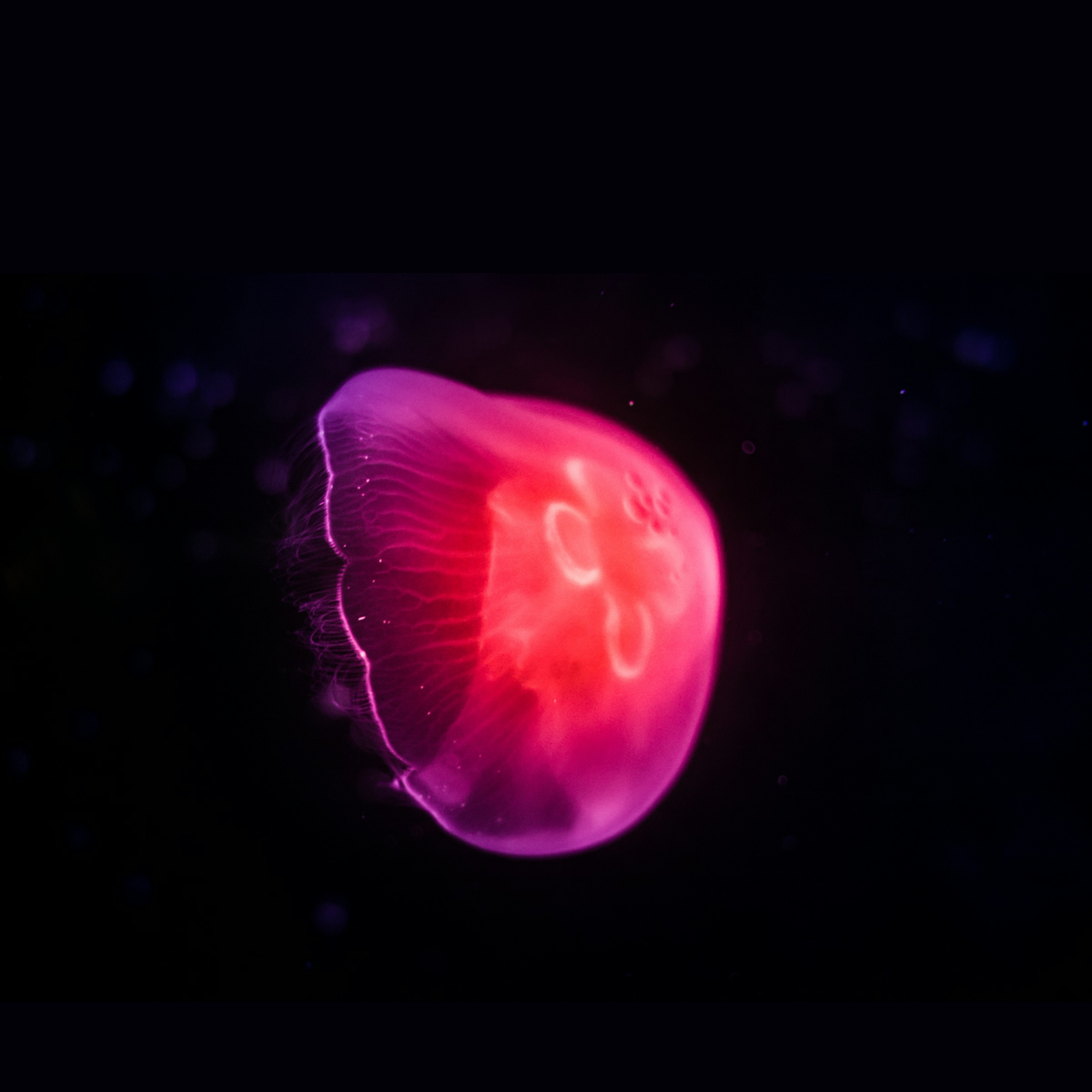
Download the prepared jellyfish PNG
(1200 × 1200). The photograph is by Leon Wu on Unsplash, used under the Unsplash License. We resized the whole photograph to 1200 pixels wide and placed it 300 pixels below the top of a dark square field. The download contains no text or effects.
The bright rim gives the screen treatment a clear edge. The saturated pink makes color spread easy to spot, while the dark background gives it room to show. For your own source, look for those relationships rather than an image that already contains scanlines or tape damage.
Add the PNG to an empty session. Keep the picture centered at 100% scale and 0° rotation, with the canvas at 1200 × 1200. Pause playback at the start, leave Composition motion off, and leave Global Stack empty.
Choose Add → Text, then Edit text, enter SIGNAL, and confirm with Command+Enter. Use bundled Inter and these Active Layer settings, setting the position after the typography:
- Font size: 170 px; weight: 800; style: normal
- Color: #f4ede2, fully opaque; alignment: center
- Letter spacing: 3 px; word spacing: 0 px; line height: 1
- Box width: 1100 px; Auto height
- Scale: 100%; rotation: 0°
- X position: 0; Y position: -490

Select the picture layer before adding effects. Leave the text layer’s stack empty. Separate effect stacks on poster layers explains how this keeps essential lettering readable while the picture changes.
For each recipe below, turn every effect’s Motion switch off, leave Mix at 100% and Blend at Normal, and add the effects in the listed processing order. These are the settings used for these images, not a claim about permanent defaults.
Recipe 1: a CRT screen treatment
Start with an empty picture stack. From the CRT collection, add Phosphor Glow, then Scanlines.
Phosphor Glow
- Phosphor size: 0.008
- Light spread: 0.006
- Glow strength: 0.75
- Emission threshold: 0.20
- Mask strength: 0.45
Phosphor size controls the visible cell scale. Light spread and Glow strength control the luminous spread; Mask strength controls how much of the repeating structure shows. Adjusting the mask separately lets you keep the light without making the surface pattern dominate.
Scanlines
- Line spacing: 0.006
- Gap width: 0.35
- Strength: 0.45
- Beam: 0.35

CRT only: Phosphor Glow → Scanlines. The repeating pattern is clearest inside the bright pink body.
Compare the jellyfish’s illuminated body with its dark surroundings. The pattern should describe a screen surface while leaving the curved silhouette recognizable. If the picture looks too striped, lower Scanlines Strength before changing the source or adding another effect.
Recipe 2: a VHS recording treatment
Remove the CRT effects from the picture stack for this comparison. From the VHS collection, add Signal Bandwidth, then Chroma Bleed.
Signal Bandwidth
- Luma bandwidth: 0.400
- I bandwidth: 0.030
- Q bandwidth: 0.030
- Vertical color bleed: 0.20
- Chroma delay: 3.0 px
The bandwidth controls separate brightness detail from two color components. Lower values reduce detail in that component. Keeping more luminance detail than color detail gives a different result from uniformly blurring the whole photograph.
Chroma Bleed
- Trailing color: 0.30
- Color spread: 0.016
- Color offset: 0.006

VHS only: Signal Bandwidth → Chroma Bleed. Inspect the softer right edge against the dark background.
The image still has a clear outline, but the pink boundary spreads and the bright internal shapes soften. There are no phosphor cells or added scanlines in this version. It demonstrates recording character without tracking bands, dropouts, or other playback faults.
Recipe 3: VHS followed by CRT
Keep the two VHS effects and append the two CRT effects using exactly the settings above:
- Signal Bandwidth
- Chroma Bleed
- Phosphor Glow
- Scanlines

VHS + CRT: the recording treatment is processed before the screen treatment.
This order puts the screen pattern over the already softened picture. Applying bandwidth reduction after the CRT effects would also process the screen’s fine structure. For this cover, keeping that structure at the end makes the two contributions easier to read.
You do not have to add Screen Curvature. This example suggests a screen surface without rounding the photograph into a television-shaped frame. It is an artistic approximation, not a calibrated reconstruction of a particular television or tape deck.
Keep the result readable at cover size

Each panel uses the same 400 × 400 region of its 1200 × 1200 render. Compare edge softness separately from the repeating surface pattern.
Muddy color: Disable Chroma Bleed first to judge Signal Bandwidth on its own. Reduce Color spread or Color offset if the pink crosses too far into the dark area. Raise I and Q bandwidth if too little color detail remains.
Excessive glow: Lower Glow strength first. Reduce Light spread if the halo reaches too far. Increasing Mask strength will not recover detail already lost beneath a broad glow.
Distracting scanlines: Lower Strength or Gap width. Check the result at the size people will actually see it; a pattern that reads clearly at full resolution may compete with the subject in a small cover thumbnail.
Detail disappearing when reduced: Compare the exported image at full size and at its intended display size. Fine phosphor cells and line patterns can merge or produce interference as an image is resampled. Adjust Phosphor size and Line spacing while checking that smaller view. Keep essential small text on an untreated layer.
A still that feels too quiet: This recipe deliberately excludes motion. Flicker, rolling, and tracking disturbances need playback to assess; a single frame cannot demonstrate their timing. A readable still cover is a complete outcome on its own.
Export the cover and keep the choices editable
Use Quick Export → PNG for a still at the source dimensions. Inspect the exported file at its intended viewing size before choosing the final treatment. Keep the composition in an Artfkt project so you can revise the text and stacks later.
Artfkt brings CRT, VHS, separate layer stacks, and editable lettering into the same Mac workspace. If that is how you want to build covers, explore the collections or use the purchase link below. The free browser demo is useful for trying Glitch, Pixel, and Cameras on one image, but it cannot reproduce these CRT/VHS recipes. Browser export is already included.
How these examples were made
Artfkt produced all four 1200 × 1200 renders from the same prepared photograph with bundled Inter lettering, playback at zero, and effect motion disabled. The comparison and detail sheets were assembled from those renders; the effects were not painted onto mockups. The recipes were rendered using the WebGPU backend, and results can vary by device. AI assisted the article, composition, and capture tooling. The photograph remains credited to Leon Wu above.
Make something unexpected
Keep exploring in Artfkt.
Bring all collections and multiple image layers together in one Mac studio. Build a look, shape its motion, and save your next starting point.