How to Make a Duotone and Gradient Map Cover
Map a still-life painting to navy and gold in Artfkt for Mac, then replace that pair with a four-stop gradient and reuse the stack.

To make a duotone effect in Artfkt for Mac, add Duotone and choose one color for the shadows and one for the highlights. Replace that effect with Gradient Map when the cover needs more than two colors.
Both effects remap brightness. They do not make printer plates, and they are not a calibrated print duotone. The Color collection is in the desktop app. The free collection demos load Glitch, Pixel, and Cameras, so they do not include Duotone or Gradient Map. Where a gradient control does appear, including on those sites, it uses the same gradient editor.
Start with a picture that has real shadows and highlights
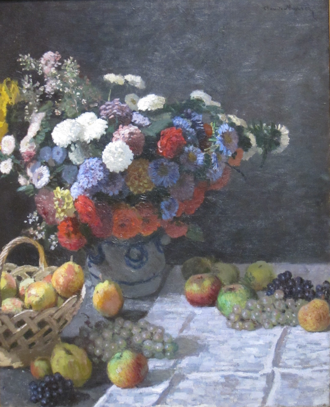
Download the still-life PNG (1400 × 1727). It is a proportional resize of a public-domain painting. A flat graphic with little tonal range gives both effects less to separate. Use your own photograph the same way.

Start a new session and add the picture first. An empty canvas takes that image’s size. Leave Scale (%) at 100 and Angle (°) at 0. Leave Shared animation off and playback paused at the start.
For a headline, add a text layer and follow add effects to editable text. This cover leaves the painting without type.
Map shadows and highlights to two colors
Select the picture. Search the catalog for Duotone and add it. Turn Animate: Duotone off.
- Shadows: #1b2a4a
- Highlights: #f2c14e
- Tonal balance: 0.46
- Transition: 0.42
Keep both colors fully opaque.

Tonal balance moves the split between the two colors. Transition softens that split. A lower transition makes a harder poster edge; this example stays partly soft so the fruit still reads. Treat each poster layer with its own effect stack uses Duotone on lettering instead of on the whole picture.
Extend the same picture to a gradient map
Disable Duotone or remove it, then add Gradient Map on the same layer. Turn Animate: Gradient Map off. Open Gradient and set four stops:
- 0%: #10243f
- 34%: #1f6f78
- 67%: #e07a5f
- 100%: #f6edd6
- Tone balance: 0.08
The editor under the gradient label is the same control used for other gradients: up to 32 stops, with opacity on each stop if you need it. This example keeps every stop opaque. Tone balance shifts which brightness lands on which stop. It does not move the stops themselves.
The darkest passages take the navy stop. On this painting, the background and fruit spend more of their tones in teal and coral, and the brightest flowers take the cream. A different picture will land on the stops differently. That is the map working, not a second grade.
Reuse the treatment
Select the picture and open My Artfkts. Choose Save current FX…, name the stack, and save it. On the next picture, open My Artfkts, select that Artfkt, and Apply with Replace or Append. This copies the effect onto one layer at a time. It does not export a folder of covers.
Export a PNG
Use Quick Export and choose PNG. These examples match the 1400 × 1727 source. Another size is available within the limits of the renderer on your Mac. The PNG is the finished cover. It is not a spot-color separation.
One expanded effect is remembered while you switch layers. That open state is not saved with the project. This recipe does not use a keyframe timeline.
Read why the studio lives on the desktop.
How this example was made
The source is a photographic reproduction of Claude Monet’s Still Life with Flowers and Fruit (1869). The reproduction is public domain; its color and lighting are not a calibrated record of the painting. We resized it proportionally to 1400 × 1727. The treatments shown were rendered by Artfkt’s production renderer at that size, with Animate off and playback at the start, with AI assistance in preparing the page. These settings describe the pictured example. They are not permanent defaults, and rendering can vary by device.
Make something unexpected
Keep exploring in Artfkt.
Bring all collections and multiple image layers together in one Mac studio. Build a look, shape its motion, and save your next starting point.