How to Add a Folded Paper Crease Effect to Artwork
Add realistic accordion and poster paper folds to any photo or artwork in your browser. Tune panel count, fold angle, shading, and export a PNG free.
TL;DR
- Procedural Folded Paper bends your artwork across real directional planes and lights opposite facets, avoiding stock JPEG tiling seams.
- Adjust Panels, Angle, Fold depth, and Crease shade independently for subtle letter folds or heavily creased pocket maps.
- Open the folded paper recipe in your browser, swap in any poster or photo, and export a PNG free.

To give a digital poster or illustration convincing folded paper creases without stretched stock overlays, compute angular facet depth and highlight-to-shadow crease lighting directly on your artwork with Folded Paper, then layer mild Print Wear on top. Both live in the Collage and Grain collections. Open the worked folded paper recipe to load your own design and export a PNG free.


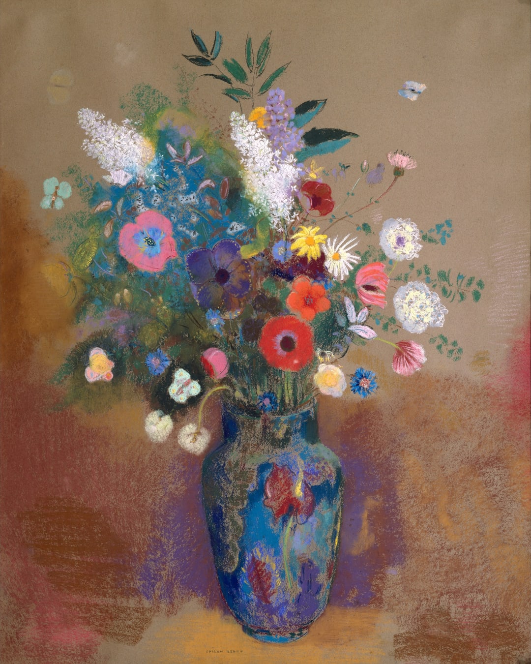
Try folded paper creases on your poster or photo. Choose Open photo to load any poster, album cover, or illustration while keeping the fold geometry active, or download the practice painting (1080 × 1350 JPG, Odilon Redon Bouquet of Flowers, The Metropolitan Museum of Art Open Access CC0).
Why procedural folds beat flat paper texture overlays
Stock crumpled-paper JPEGs rarely align with your image’s orientation: stretching a horizontal overlay onto a tall flyer distorts paper grain, and Multiply or Overlay blending only darkens pixels without bending image lines slightly at each ridge. Folded Paper calculates clean mathematical creases fitted to your frame’s aspect ratio, shading lit and unlit faces across every ridge.


- Folded Paper sets Panels (
2to16), Angle (-180°to+180°), Fold depth (0to0.85), Crease shade (0to1), and underlying Paper tone (#f0e7d4) peeking along sharp worn ridges. Pair with our tactile print guide and photocopy zine recipe when building zines or gig flyers. - Print Wear (
Mix 0.55) adds minor corner scuffs (0.18), edge abrasion (0.34), and fine cross-creases (0.15) so folds never look too geometrically sterile.
Add realistic folds to your poster in four steps
- Open the folded paper recipe and choose Open photo. All GPU shading executes locally on your machine (
/privacy/explains site analytics only). - Expand Folded Paper in Active FX. Choose Panels (
3for a neat letter fold,4–6for posters,8–12for folded brochures or maps) and dial Angle (0°vertical,90°horizontal, or-24°dynamic diagonal). - Set Fold depth (
0.30–0.60) and Crease shade (0.40–0.60). Keep Fold depth restrained on busy typography so headlines remain easy to scan across crease ridges. - Keep Print Wear subtle or mute it for freshly scored crisp cardstock, then save via Export → PNG (turn the default watermark off free anytime in Settings → Export Settings).
| Effect | Parameter | Value |
|---|---|---|
| Folded Paper | Panels | 6 |
| Folded Paper | Fold depth | 0.56 |
| Folded Paper | Angle | -24° |
| Folded Paper | Crease shade | 0.52 |
| Folded Paper | Paper | #f0e7d4 |
| Print Wear | Wear | 0.24 |
| Print Wear | Edge wear | 0.34 |
| Print Wear | Creases | 0.15 |
| Print Wear | Mix | 0.55 |
Can you fold paper without aging stains or scuffs?
Yes—simply toggle Print Wear off or lower its Mix slider to 0. Folded Paper handles clean structural ridges and directional light on its own, giving gallery prints or sleek packaging mockups sharp modern scoring.
What else can you build in Artfkt desktop?
Desktop expands browser experiments into multi-layer collage compositions with cutout shapes, typography layers, masks, saved .artfkt project files, saved custom Looks, and full Export presets across all 392 effects.
Start with your own photo
Add crisp accordion creases to any artwork.
Tune panel count, fold angle and directional shade on your poster or photo and export a PNG free. Desktop adds multi-layer collage and masks.