How to Make a Photocopy Effect for Posters on Mac
Turn a flower photo into a photocopy poster in Artfkt for Mac. Compare threshold, toner softness, and speckles while keeping the headline editable.

To make a photocopy effect in Artfkt for Mac, add Photocopy to your picture, set Threshold so the subject stays recognizable, then introduce toner softness, edge breakup, or speckles. Keep the headline on a separate text layer so it stays readable while the photograph becomes distressed.
This example turns a flower photograph into a poster. Artfkt runs on Apple Silicon Macs with macOS 13 or later. Photocopy belongs to the Halftone collection; it and editable text are outside the current free browser demo, which includes Glitch, Pixel, and Cameras on one image. The result is a digital print-like treatment, not calibrated photocopier output or a set of printer separations.
Start with a shape that survives the threshold
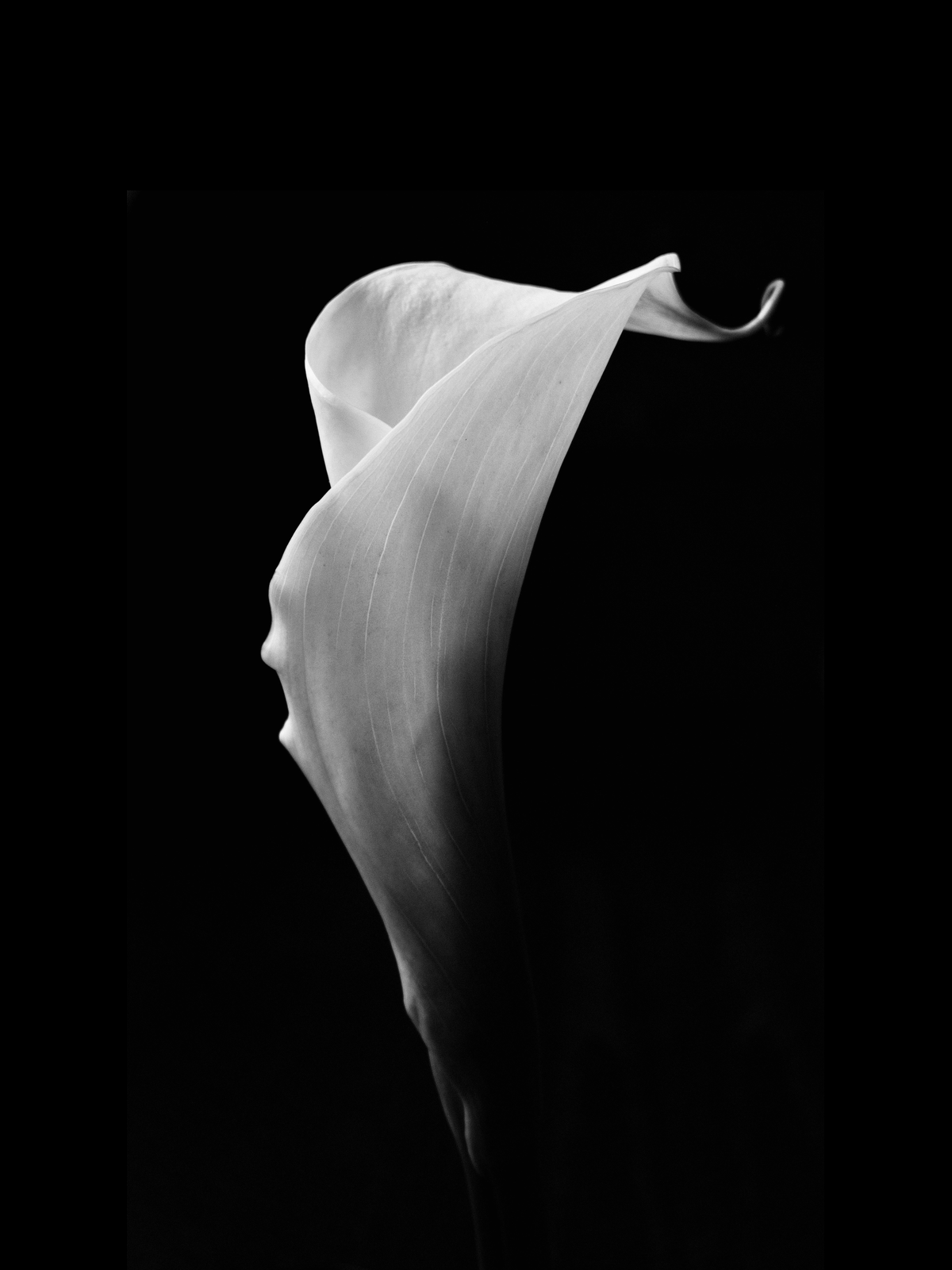
Download the prepared flower PNG
(1200 × 1600). The photograph is by Jocelyn Morales on Unsplash, used under the Unsplash License. We resized the whole photograph and placed it on a black field with space above for the headline. The download contains no text or effects.
For your own picture, look for a clear contour and a range of light and dark tones. Here, the pale folded flower separates from the background, while the shadow down its side gives Threshold something to simplify. Fine veins will disappear sooner than its outer shape.
Add the PNG to an empty session. The canvas takes its 1200 × 1600 size. Leave the image at 100% scale, 0° rotation, and centered. Keep playback paused at the start and Composition motion off.
Keep the headline editable
Choose Add → Text, then Edit text. Enter AFTERIMAGE and confirm with Command+Enter. Use bundled Inter and these Active Layer settings; set the position after the typography:
- Font size: 130 px; font weight: 800
- Color: #f2e8d5, fully opaque
- Alignment: center
- Letter spacing: 3 px; word spacing: 0 px; line height: 1
- Box width: 1100 px; Auto height
- Scale: 100%; rotation: 0°
- X position: 0; Y position: -690

The photograph and headline before adding Photocopy. The text is a separate layer.
Select the picture layer before adding the effect. Leave the Global Stack empty. Separate effect stacks on poster layers explains that distinction; editable text effects covers revising and saving the lettering.
Find the clean toner shape first
Search for Photocopy in Halftone and add it to the picture. Turn its Motion switch off so the threshold stays at the value you enter. Start with no added distress:
- Threshold: 0.40
- Toner softness: 0.025
- Edge breakup: 0.000
- Speckles: 0.000
- Toner size: 0.003
- Toner: #17171b; Paper: #f2e8d5, both fully opaque
- Seed: 37; Mix: 100%

The clean baseline: Threshold 0.40, with Edge breakup and Speckles at zero.
Threshold decides which tones become dark toner. Raising it turns more of the photograph dark; lowering it leaves more of the light paper color. Even without added speckles, the photograph’s own texture can break up the boundary. Establish this shape before judging how much distress it needs.
See what a higher threshold removes
Change only Threshold to 0.78. Keep the other baseline settings unchanged.

Threshold 0.78: a more fragmented shape, with much less of the flower remaining.
The bright fold survives, but the broad body loses its continuity. That can work for an abstract cover; it is a poor choice if the whole flower needs to read immediately. Return Threshold to 0.40 for the remaining comparisons. Adding noise cannot recover a shape already removed by thresholding.
Separate softness from edge breakup
From the clean baseline, change only Toner softness to 0.150.

Toner softness 0.150 broadens the transition between the toner and paper colors.
Softness changes the tonal transition; it does not add paper grain. Restore Toner softness to 0.025, then change only Edge breakup to 0.180.

Edge breakup 0.180 roughens areas near the threshold. Speckles is still zero.
Breakup moves the cutoff locally. It roughens the boundary without scattering marks throughout the empty background. Restore Edge breakup to 0.000 before trying speckles.
Choose light or heavy distress
Change only Speckles to 0.018 from the clean baseline. This is the finished cover version.
Speckles 0.018: marks cross the flower and background, while the separate headline stays solid.
For a heavier treatment, raise only Speckles to 0.070.

Speckles 0.070: more distress, with the same threshold, seed, and toner size.
The effect inserts toner-colored and paper-colored marks across the picture. Toner size controls their cell scale; Seed changes their arrangement. Keep both fixed when comparing amounts. Check the poster at a small viewing size: if the background competes with the flower or the spaces around the letters, return to the lighter version.
For colored screens instead of this toner treatment, try the risograph poster tutorial.
Export the poster
Return Speckles to 0.018 for the cover recipe. Choose Quick Export → PNG. The example is 1200 × 1600; other dimensions depend on your device’s rendering limits. The PNG contains the finished composition. Save a project as well if you want to revise the text and effect settings later.
If the result is hard to read:
- The flower disappears: lower Threshold before adding more texture, or choose a source with clearer tonal separation.
- The headline becomes distressed: move Photocopy to the picture’s stack and keep the text on its own layer, outside any treated Global Stack.
- The texture dominates: lower Speckles; use Edge breakup when only the tonal boundary needs roughening.
- The still changes during playback: turn Photocopy’s Motion switch off and pause at the start before comparing settings.
How this example was made
Artfkt prepared this tutorial using Jocelyn Morales’s photograph, bundled Inter, and the production renderer. The source layout, capture script, and writing were prepared with AI assistance. The flower is a photograph; the treatments shown are actual effect renders. Every comparison uses the same 1200 × 1600 composition and seed, with animation disabled and the render time at zero. The settings describe these examples, not permanent defaults; rendering can vary by device.
Make something unexpected
Keep exploring in Artfkt.
Bring all collections and multiple image layers together in one Mac studio. Build a look, shape its motion, and save your next starting point.